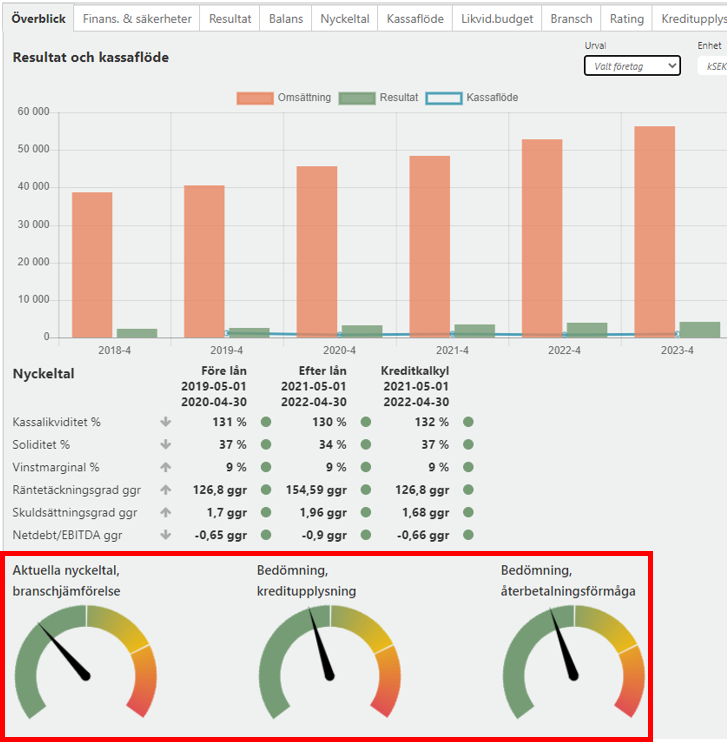
Current key figures industry comparison (Aktuella nyckeltal branschjämförelse) - shows how well the applicant companies' key figures perform compared to companies in the same industry and this refers to the latest reported annual report. Not to be confused with Key Figures that are presented above this meter, which is how well the key figures perform in absolute terms, ie not in line with the industry. A company may, for example, have a yellow outcome on the meter but green on Key figures above and then it is because the industry has a higher outcome compared to the total and then it will still be yellow.
Credit Disclosure Assessment (Bedömning kreditupplysning) - is the risk forecast the company received from credit reporting companies. Risk class is converted according to current rules that credit reporting companies have. Green is a low risk, Yellow is a normal risk and Red is a high risk of bankruptcy.
Assessment repayment ability (Bedömning återbetalningsförmåga) - based on how key figures are developed for the column "Credit calculation" above, if one of the key figures turns yellow or red, the meter is moved to that field. The year on which it is based is the current year +1. Depending on how many turn yellow or red, the meter ends up in different fields and indicates a poorer ability to repay loans. Calculation is based on the bank's regulations regarding amortization period and discount rate that are set for Capitex Corporate Loans.
How to interpret the meters regarding colors
Depending on how the company's KPI;s are they will translate into the meter and be placed in the green, yellow or red segment of the meter.
Green - all KPI:s are green and how high the meter is on the green scale is depending on how high each KPI:s are, see detailed explanation below.
Yellow - when minimum one KPI is yellow the meter will show yellow. Depending on how many of the KPI:s that are yellow it will show more or less on the yellow result. One KPI represents 1/4 fourth of the area and how low the meter is on the yellow scale is depending on how low each KPI is, see detailed explanation below.
Red - when minimum one KPI is red the meter will show red. Depending on how many of the KPI:s that are red it will show more or less on the red result. One KPI represents 1/4 fourth of the area and how low the meter is on the red scale is depending on how low each KPI is, see detailed explanation below.
Picture
The precise edge values of the meters
Most meters are really based on a single “pivot value”. Different meters use different pivot values, as per the table below.
Type of meter | Pivot value |
|---|---|
Current key figures industry comparison | The number of KPIs that are better than the industry’s is used as the pivot value. |
Credit Disclosure Assessment | The Probability of Default (PD) from the credit disclosure is used as the pivot value. |
Assessment repayment ability | The total new credit amount that the company is applying for is used as the pivot value. |
Note that all meters on the page Känslighetsanalys / Sensitivity analysis are of the type Assessment repayment ability.
Each meter has four transition points:
0, the extreme edge of the red area,
25, the transition from yellow to red,
50, the transition from green to yellow,
100, the extreme edge of the green area.
The rule explained above states that if a minimum of one KPI is red, the meter will be somewhere between 0 and 25. If a minimum of one KPI is yellow and no KPIs are red, then the meter will be somewhere between 25 and 50. And if all KPIs are green the meter will be somewhere between 50 and 100.
Because of this rule, our calculation engine begins by calculating the pivot value at transition points 25 and 50. For example, for an Assessment repayment ability meter, the calculation engine would calculate:
What is the highest total new credit amount that the company can apply for while no KPIs are red? This is the pivot value at 25.
What is the highest total new credit amount that the company can apply for while each KPI stays green? This is the pivot value at 50.
When the pivot values at 25 and 50 are known, the calculation engine uses linear interpolation to determine the pivot values for 0 and 100. Continuing the example:
The transition point 25 has the pivot value 13 450 000 SEK, which means that that’s the highest total new credit amount that the company can apply for while no KPIs are red.
The transition point 50 has the pivot value 12 345 000 SEK, which means that that’s the highest total new credit amount that the company can apply for while each KPI is green.
Using linear interpolation, the pivot value at 100 would be calculated as:
First the size of the yellow area 25-50 is calculated: 13 450 000 SEK - 12 345 000 SEK = 1 105 000 SEK.
Thus the size of the green area 50-100 should be double that, 1 105 000 SEK * 2 = 2 210 000 SEK.
And by subtracting the size of the green area from the pivot value at the transition point between green and yellow, 50, we get the pivot value of 100: 12 345 000 SEK - 2 210 000 SEK = 10 135 000 SEK.
The corresponding method is used for calculating the pivot value at 0, with respect to the fact that the area between 0 and 25 is half the size of the area between 50 and 100.
The place that the pointer of the meter points to is then the actual pivot value. For example, the actual pivot value for a simulation (känslighetsanalys) meter is the actual total new credit amount that the company is applying for.